CarbonMinus

Net Zero For Net Gain
Visit website

Services

Brand Strategy
Digital Experience Design

Industry

B2B SaaS
Sustainability & Climate Tech

Tags

Positioning

Visual Identity

Investor Readiness

Web Design

The Challenge

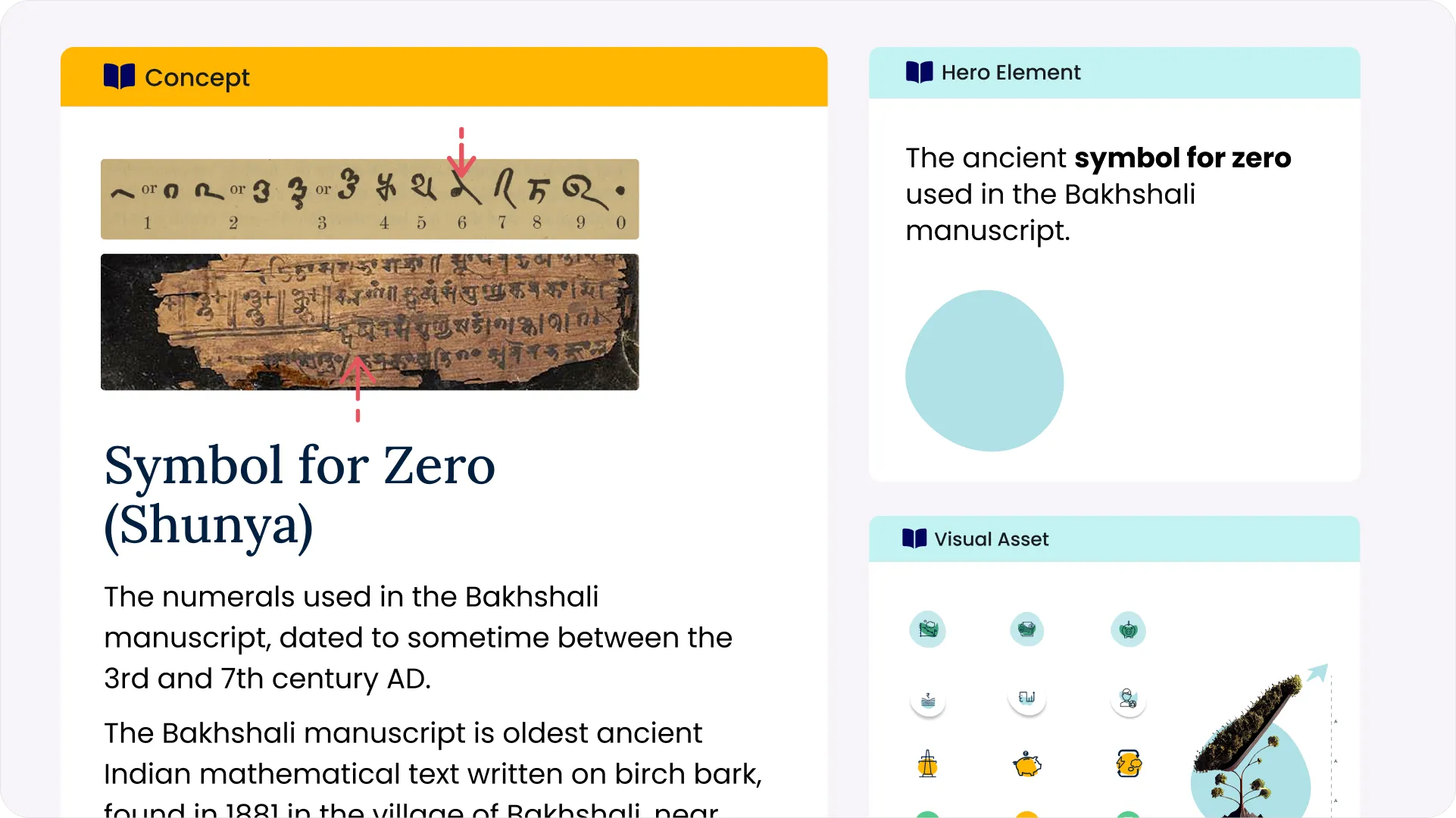
When Enerlly, a software company specializing in energy management solutions, evolved into something much bigger and entered the realm of sustainability, carbon management, and multi-resource optimization, it needed a brand that could grow with it.

The challenge was to - 

  • Shift from a niche tech identity to a global ClimateTech innovator
  • Clearly communicate a complex multi-resource management offering
  • Reflect the transition to a net-zero narrative and multi-market relevance
  • Prepare for rapid expansion into the competitive US market
  • Establish immediate credibility with enterprise buyers and investors

Our Approach

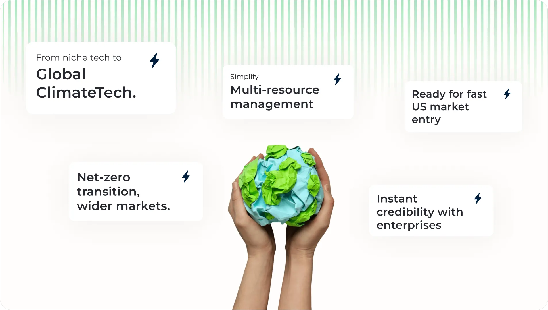
We used deep market intelligence, customer-centric research, and strategic design,  aligning every creative decision to reinforce Enerlly’s new position as a ClimateTech leader. We had to think beyond just a rebrand. It was about repositioning the product, aligning it with a global shift, and making sure that value was clear right from the name and visual identity.

Execution

Phase 1: Market mapping and Competitor Research

  • AConducted analysedis of 8 global sustainability brands across 11 critical dimensions
  • Identified high-demand segments through precise market research
  • Created buyer personas from direct customer interviews and mapped journeys

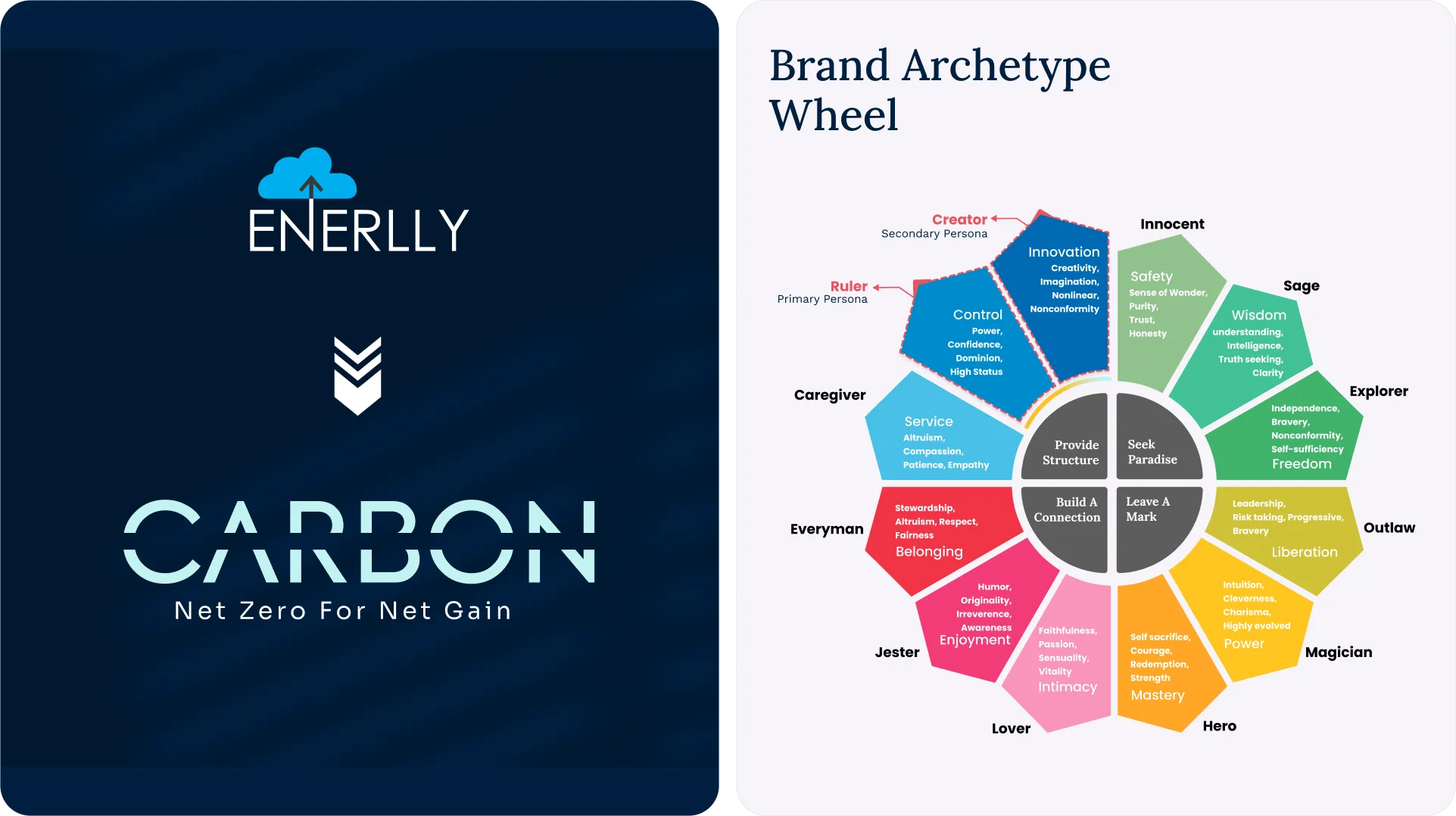
Phase 2: Naming and Brand Development

  • Name reflects product value —> helping companies reduce carbon —> move toward net-zero
  • Future-ready name —> flexibility to evolve —-> perfect for broader broader modules and subproducts
  • Final Logo —> clean slash through the word “Carbon” —> visualizing active carbon reduction

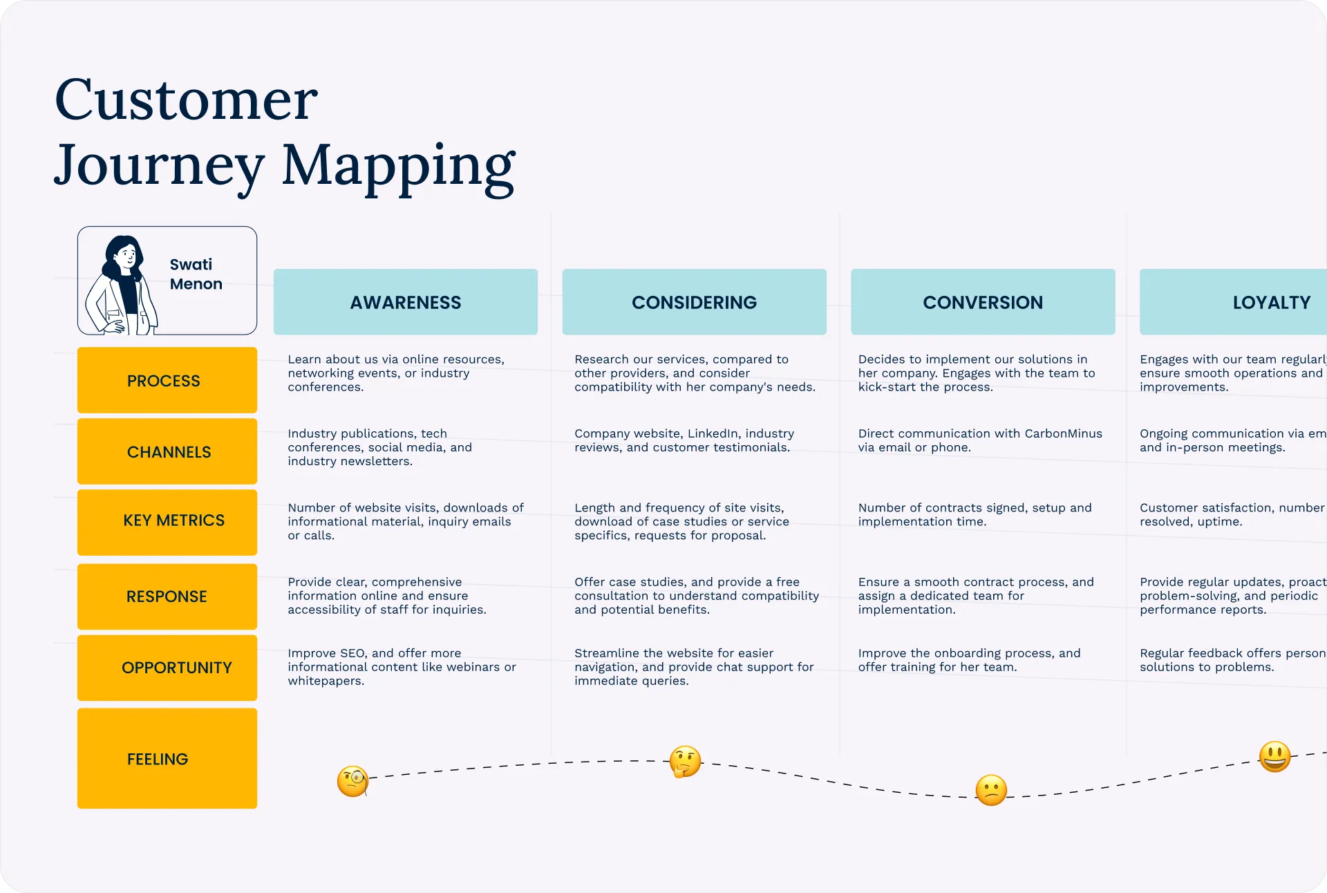
Phase 3: Positioning & Messaging

  • Compelling narrative connecting sustainability to business value
  • Strategic positioning framework
  • Powerful tagline "Net Zero for Net Gain"
  • Subtle connection to Indian roots with the concept of Shunya
  • Referencing circularity and zero, adding depth without explicit explanation

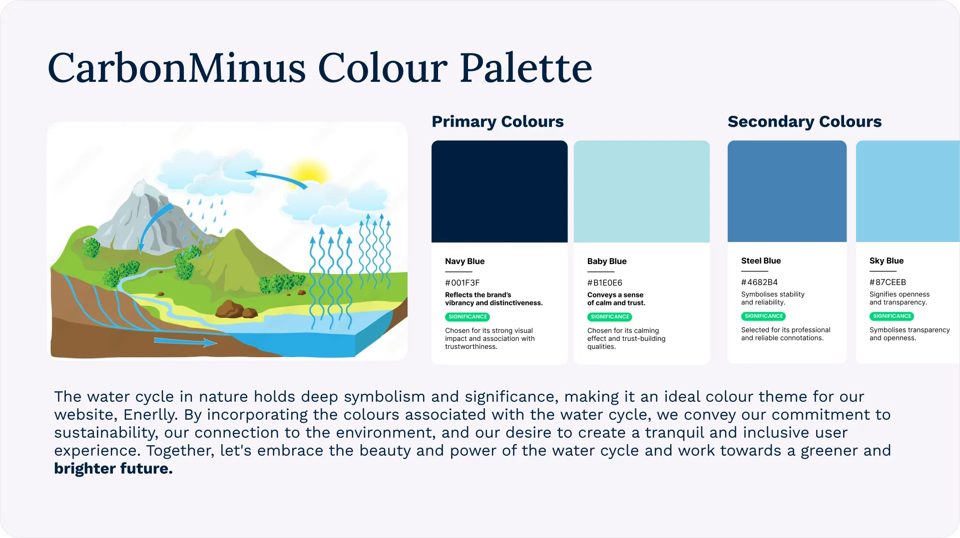
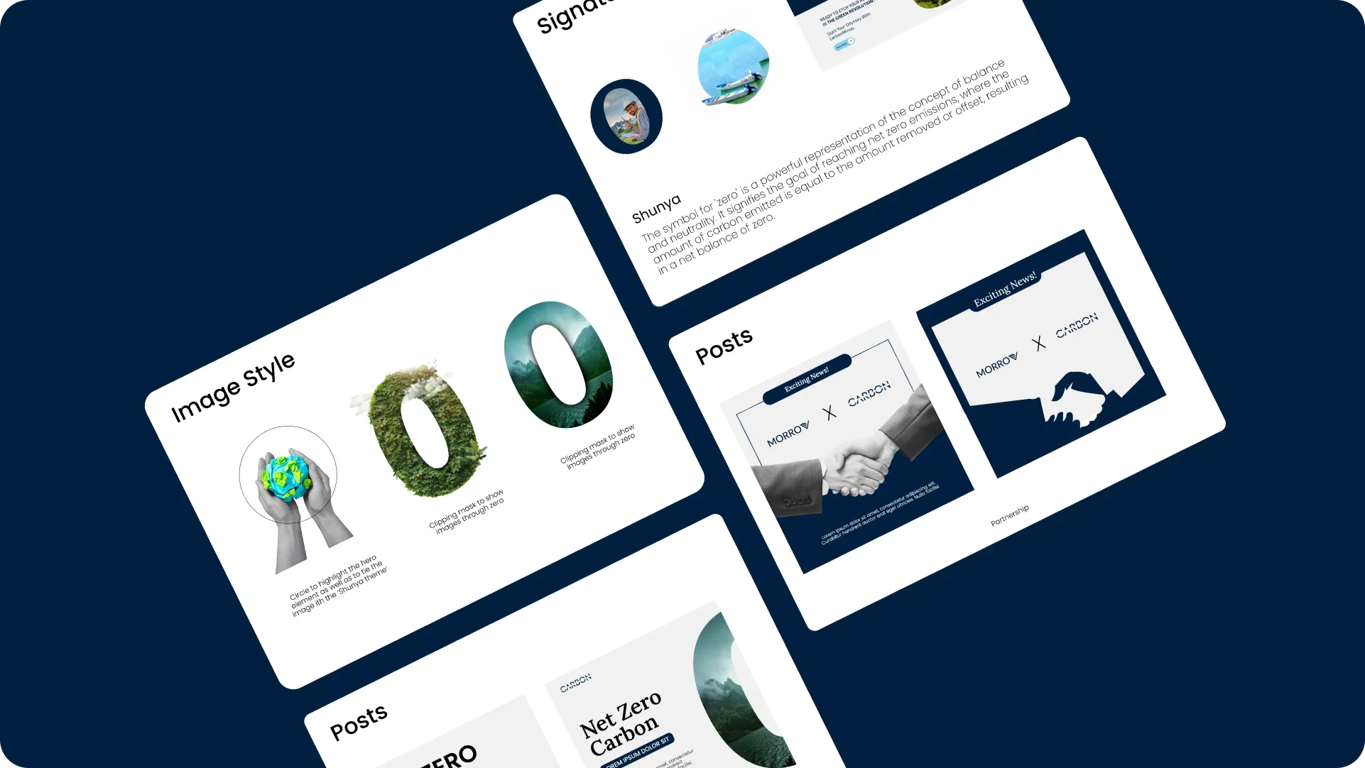
Phase 4: Visual Identity Design

  • Developed custom icons and illustrations
  • Launched comprehensive digital brand activation (website, social media) 
  • The color palette drew inspiration from the natural water cycle
  • Colors evoke trust, innovation, and transparency

Impact

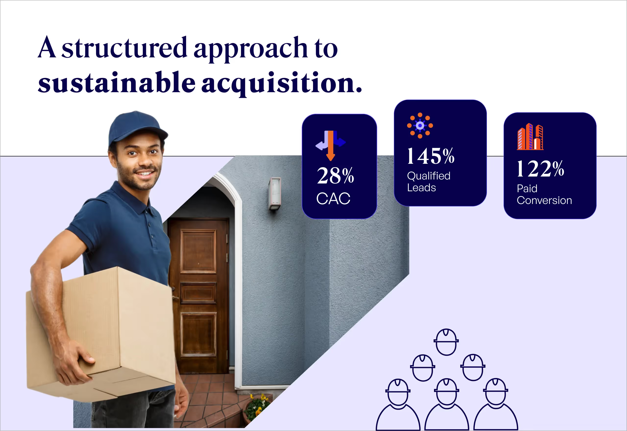
42% increase in qualified leads

Increased investor inquiries within 60 days

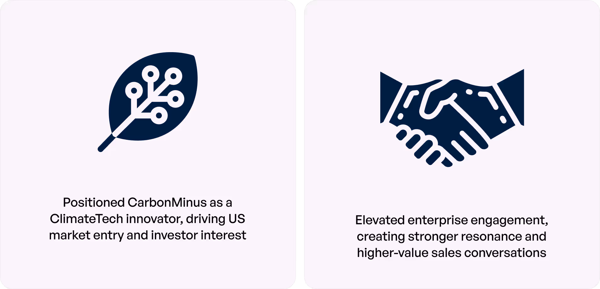
Accelerated entry into the US market

Higher enterprise buyer engagement

Related Stories

View all