Services

Digital Experience Design

Industry

No-Code / App Builder (SaaS)

Tags

Product Narrative

Motion Design (Lottie)

Video/Content Production

The Challenge

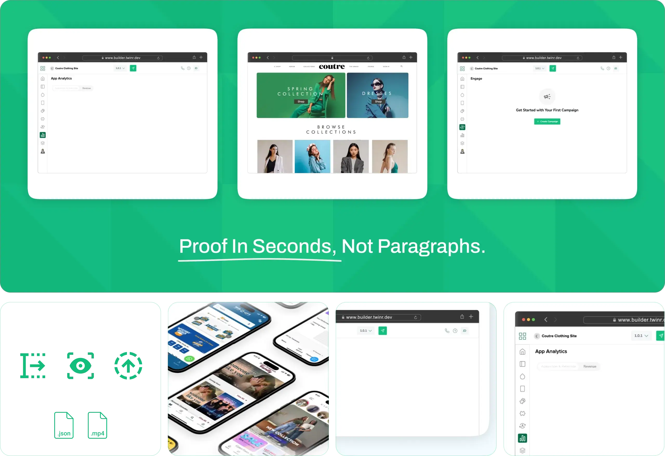
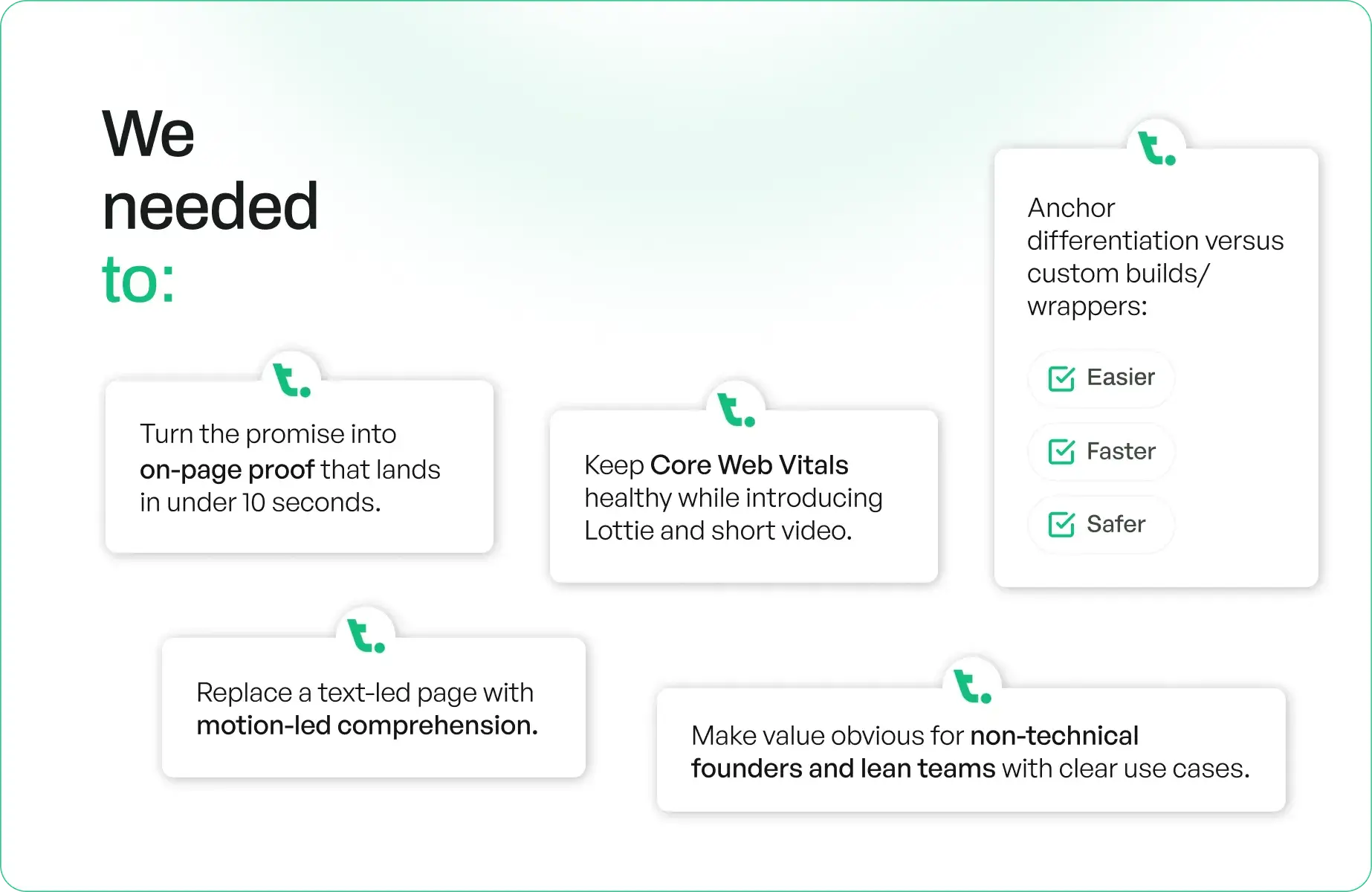
Twinr promises something deceptively simple: take your mobile-responsive website and turn it into a mobile app. The product was strong and had Product Hunt momentum, but the website felt static. “One-click” read like a claim, not an experience. Visitors couldn’t see the transformation, evaluate the steps, or feel the speed.

Net effect: curiosity without conversion.

We needed to:

  • Turn the promise into on-page proof that lands in under 10 seconds.
  • Replace a text-led page with motion-led comprehension.
  • Make value obvious for non-technical founders and lean teams with clear use cases.
  • Keep Core Web Vitals healthy while introducing Lottie and short video.
  • Anchor differentiation versus custom builds/wrappers: easier, faster, safer.
Our Approach

We designed the homepage as a product surface compressing the journey to a 3-beat model (Paste URL → Preview → Publish) expressed through Lottie and micro-interactions

Then we wired it for performance and measurement by embedding lightweight motion, CWV-safe delivery, and analytics that map attention → intent → trial.

Execution

Phase 1 — Problem Reframing & Product Narrative

  • Codified the 3-beat story as the mental model for the entire page.
  • Defined audiences/JTBD (non-developer founders, lean teams) and a message map that moves users from “What is it?” to “Let’s try it.”

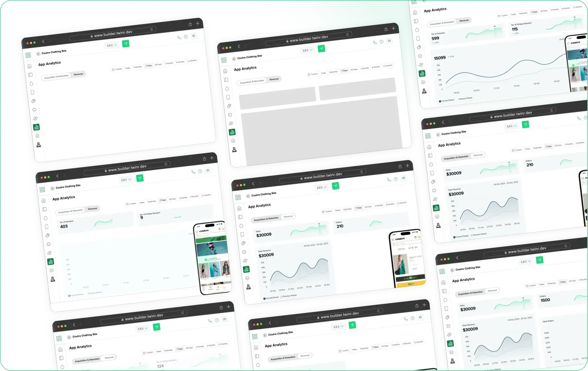
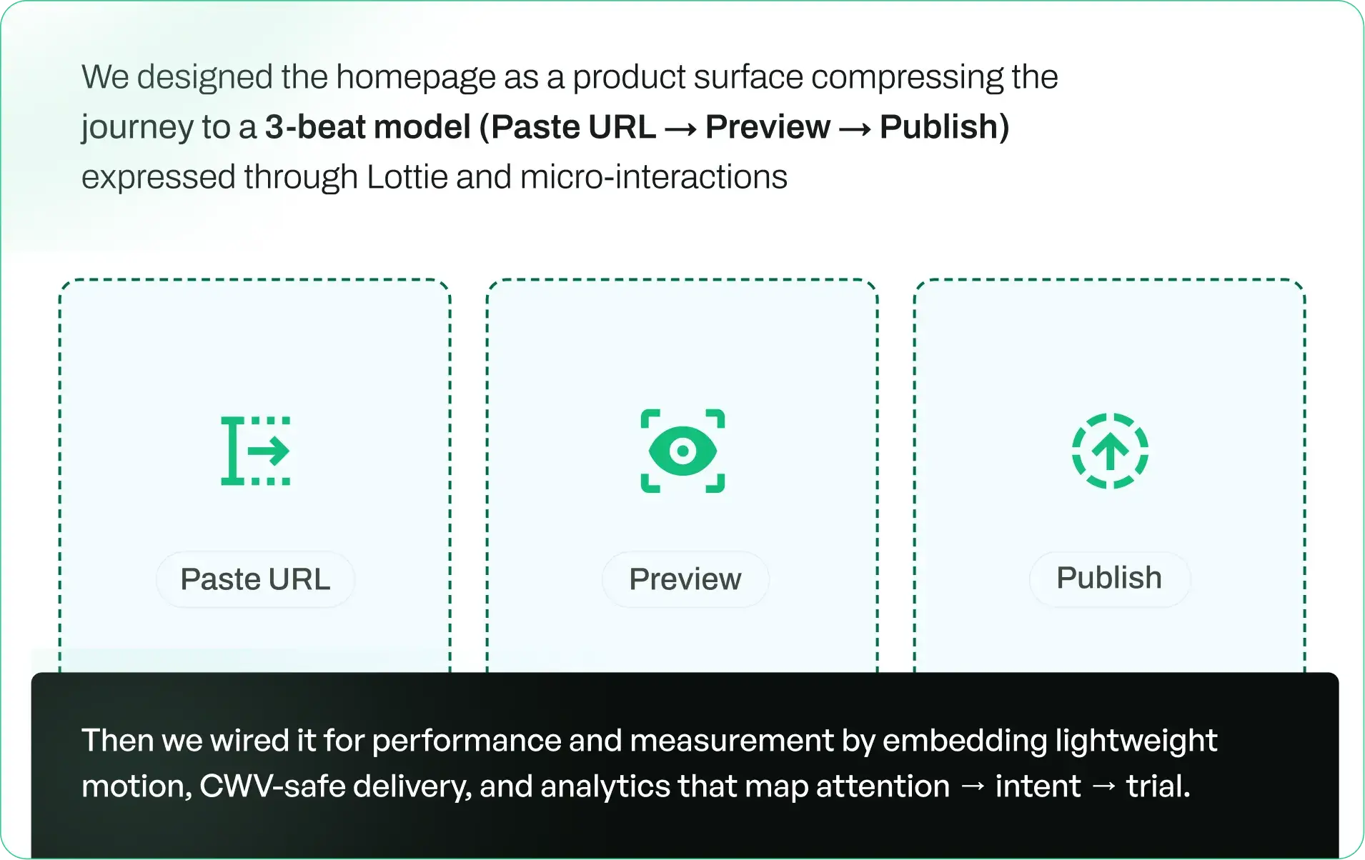
Phase 2 — Visual Proof System (Hero)

  • Designed a looping hero that shows web → app in seconds (device frame, native UI cues, success state).
  • Added micro-interactions (progress ticks, “Done” state) to signal speed and ease.

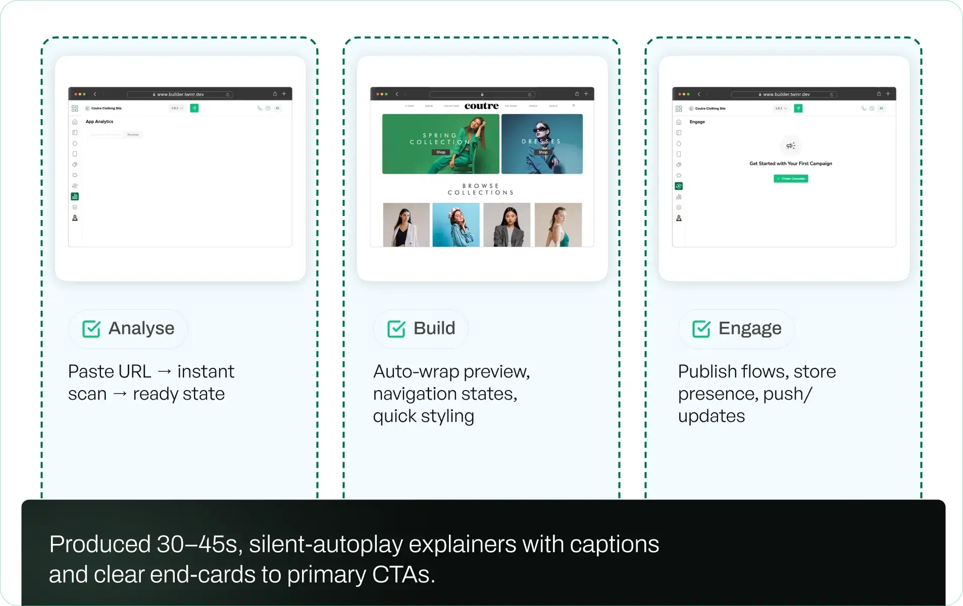
Phase 3 — Explainer Set (Analyse · Build · Engage)

  • Analyse: Paste URL → instant scan → ready state 
  • Build: Auto-wrap preview, navigation states, quick styling 
  • Engage: Publish flows, store presence, push/updates
  • Produced 30–45s, silent-autoplay explainers with captions and clear end-cards to primary CTAs.

Phase 4 — Page Architecture & Use-Case Mapping

  • Introduced use-case tiles and a template gallery to route exploratory traffic.
  • Added before/after panels (site → app) with tap targets and header states to telegraph “native.”
  • Placed trust modules (real app examples, store links) near the fold; included a concise non-dev FAQ.

Phase 5 — Performance & Delivery

  • Shipped MP4/WebM pairs, compressed loops, and deferred loading for non-critical assets.
  • Set Core Web Vitals guardrails (LCP ≤2.5s, CLS <0.1, INP <200ms) with sprite/Lottie fallbacks to keep the page fast.

Phase 6 — Measurement & Iteration

  • Monitored the funnel (attention → intent → trial) and ran weekly tests on first-frame hooks, hero pace, and CTA pairing.
  • Fed learning back into motion, copy, and layout for repeatable lift.

Impact

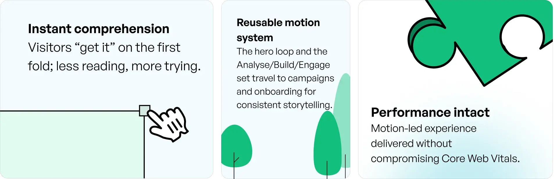
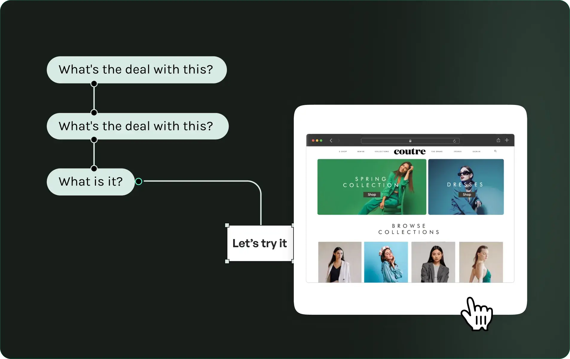
Instant comprehension

Visitors “get it” on the first fold; less reading, more trying.

Earlier trial intent

Higher clicks on Try it now and Template gallery from the hero; explainers move questions out of pre-sales.

Cleaner funnel diagnostics

A clear attention→intent→trial line of sight enables weekly iteration on hooks and CTAs.

Reusable motion system

The hero loop and the Analyse/Build/Engage set travel to campaigns and onboarding for consistent storytelling.

Performance intact

Motion-led experience delivered without compromising Core Web Vitals.

Related Stories

View all