Shopify started as a snowboard shop. YouTube was a dating site. Both companies only found their billion-dollar opportunity after their original landing pages completely flopped.
Here's what separated them from the thousands of failed startups you've never heard of: they figured out what converted visitors into buyers, and fast.
Your IT services landing page is sitting in that same moment right now. Either it's converting visitors into qualified leads, or it's burning your ad budget while your competitors eat your lunch.
The numbers don't lie. B2B service landing pages convert at just 2.9% on average, while top performers hit 10%+. That's not a small difference, it's the gap between missing your quarterly targets and building a predictable pipeline.
The problem? Most IT services landing pages look identical. Same stock photos of people shaking hands in conference rooms. Same vague promises about "enterprise-grade solutions." Same trust-killing jargon that makes decision-makers bounce within seconds.
This blog breaks down the exact elements that separate high-converting IT landing pages from the rest, backed by conversion data, not guesswork. You'll walk away with a framework you can audit against today.
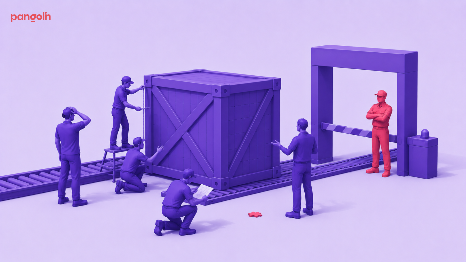
Selling IT services isn't like selling software or consumer products. The buying process is longer, more complex, and involves more stakeholders who all need different information to say "yes."
Here's what makes IT services uniquely challenging:
The buying committee is massive. B2B IT purchase decisions involve 6-10 stakeholders on average. Your landing page needs to speak to the CTO worried about security, the CFO focused on ROI, and the operations director concerned about downtime, all at once.
Trust is non-negotiable. You're asking companies to hand over their network security, data infrastructure, or mission-critical systems. One breach, one outage, one compliance failure could cost them millions. IT buyers won't even consider vendors without ironclad proof of reliability.
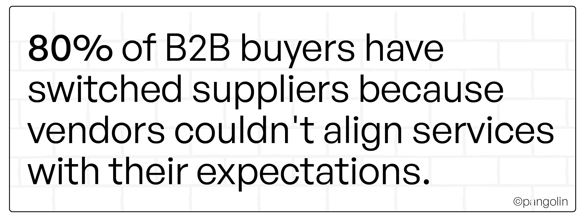
They research independently first. 81% of B2B buyers complete most of their research before ever contacting a vendor. By the time they hit your landing page, they've already looked at 3-5 competitors. If your page doesn't immediately differentiate you, they're gone.
The stakes are higher. B2B landing pages convert at 13.3% compared to 9.9% for B2C, but IT services face unique friction. Demo requests in B2B tech cost $600-$800 per lead on average. Every visitor who bounces is real money down the drain.
The baseline conversion rate across industries sits at 4.3-6.6%. Good performance starts at 10%+. That's where your page needs to be.
If your landing page isn't built for IT buyer psychology, you're already losing.
[[divider]]
Let's get tactical. Here are the elements proven to move conversion rates, with real examples and data.
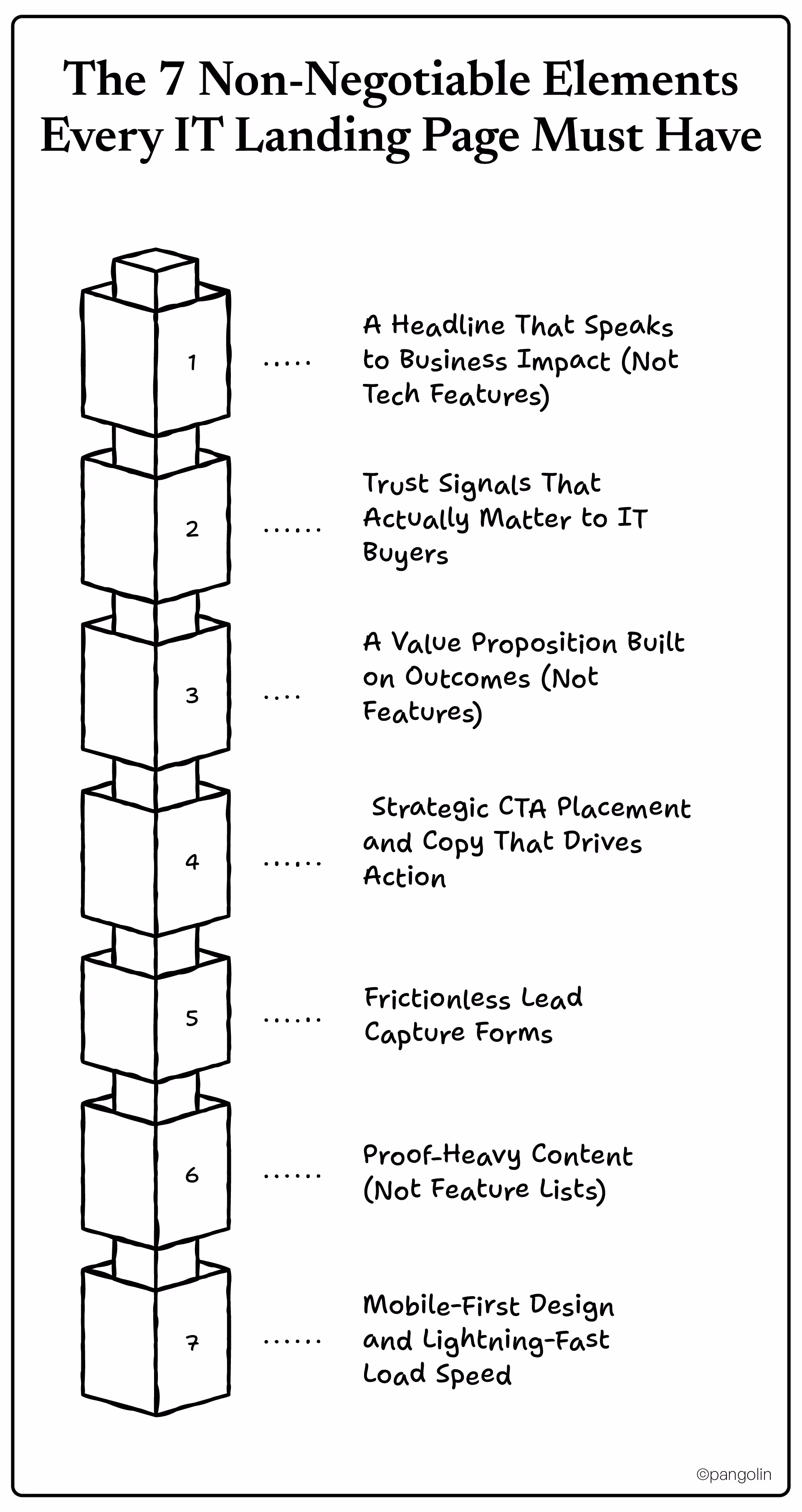
Most IT landing pages lead with this:
"Enterprise-Grade Cloud Infrastructure Solutions"
Here's what actually converts:
"Cut IT Downtime by 40% Without Adding Headcount"
The difference? The first headline describes what you do. The second describes what the buyer gets.
IT decision-makers don't care about your technology stack. They care about solving specific business problems: reducing security incidents, passing compliance audits, eliminating downtime, cutting costs.
Lead with the outcome, not the feature. Pages with clear, benefit-driven headlines see 13.5% higher conversion rates.
Formula: [Specific Outcome] for [Specific Buyer Type] in [Timeframe]
Example: "PCI-compliant payment processing for healthcare providers, deployed in 30 days"
Generic testimonials won't cut it. IT buyers need proof you can handle their specific challenges, and that you won't be the vendor who causes a catastrophic failure.
What works:
90% of consumers seek reviews before purchasing, B2B IT buyers expect even more proof.
Your trust signals answer the unspoken question every IT buyer has: "Can I bet my career on this vendor?"
Stop listing features. Start showing business impact.
Weak: "24/7 monitoring, multi-cloud architecture, AI-powered threat detection"
Strong: "Stop security breaches before they cost you $4.35M per incident, the average data breach cost in 2024"
The difference is benefits laddering, connecting features to functional benefits to emotional outcomes.
Your value proposition should answer: "What specific problem does this solve, and why should I care?"
"Contact Us" buttons are conversion killers.
Here's why: IT buyers aren't ready to "contact" you. They're evaluating options. Your CTA needs to match where they are in the buyer journey.
High-converting CTA examples:
Optimized CTAs outperform generic ones by 202%. B2B emails with clear CTAs see 371% higher click-through rates.
Placement matters:
Each CTA should feel like the next logical step, not an interruption.
Every form field you add is a conversion killer.
Research shows each additional field reduces conversions by 4-8%. But removing fields entirely can hurt lead quality. The trick is finding the balance for IT services.
The baseline IT services form:
That's it. Four fields.
If you need more qualification, use progressive profiling, collect basic info now, gather details later when trust is higher.
Other friction-reducers:
Remember: Demo requests cost $600-$800 in B2B tech. Every lead matters.
IT buyers are skeptical. They've been burned by vendors who overpromised and underdelivered.
Replace feature lists with proof:
Instead of:
✓ Advanced encryption
✓ 99.99% uptime
✓ Scalable infrastructure
Show this:
Include 2-3 brief case studies with real metrics. Show industry-specific expertise, IT for financial services is different than IT for healthcare.
Visual proof matters:
One concrete example beats ten generic claims every time.
91% of B2B professionals favor mobile-first experiences. IT decision-makers research during off-hours, on their phone during the commute, on the couch after dinner, between meetings on their tablet.
If your landing page doesn't work flawlessly on mobile, you've already lost them.
Speed matters even more:
Pages loading in 1 second convert 3x better than pages loading in 5 seconds.
IT buyers expect best-in-class user experience. If your page is slow or clunky, they assume your services are too.
Quick audit:
Your landing page UX is a trust signal in itself.
[[divider]]
Every IT services page looks the same. Here's how to break the pattern and stand out.
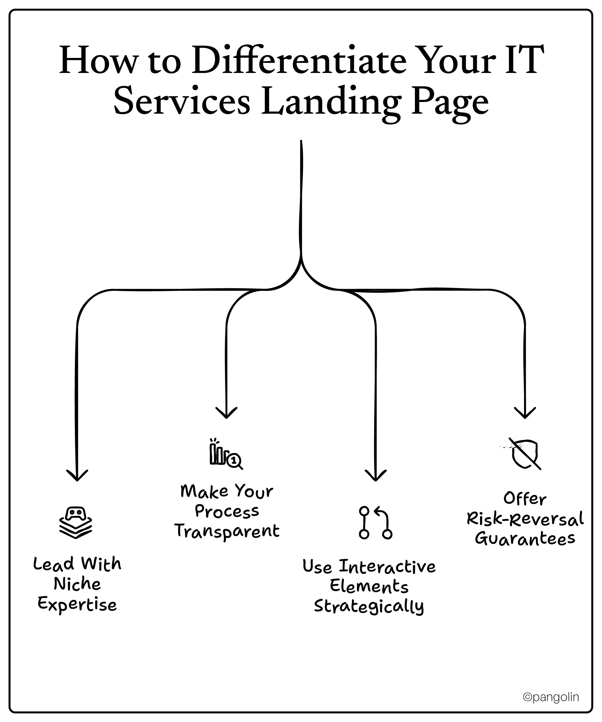
Generic positioning kills conversions.
"Managed IT Services for Businesses"
"HIPAA-Compliant Managed IT for Medical Practices"
Specificity signals expertise. When you narrow your focus, IT buyers immediately know: "These people understand my world."
Even if you serve multiple industries, create separate landing pages for each. A healthcare CTO and a manufacturing operations director have completely different concerns. Speak directly to theirs.
Most IT vendors hide their implementation process behind vague promises. That creates anxiety.
Flip it. Show exactly how you work:
Discovery → Assessment → Implementation → Support
Include realistic timelines. Be honest about what's involved. Transparency builds trust faster than any testimonial.
Example:
Buyers appreciate honesty. It sets proper expectations and filters out bad-fit clients early.
Static pages are boring. Interactive content boosts engagement by 34% compared to static materials.
Ideas for IT services:
Interactive tools accomplish two things: they engage visitors longer (more time = more trust), and they collect qualification data without feeling like a pushy form.
IT services are high-consideration purchases. Buyers fear making the wrong choice.
Lower perceived risk with guarantees:
The easier you make it to "test drive" your service, the higher your conversion rate.
[[divider]]
Not every visitor is ready to buy. Your landing page needs to match where they are in their journey.
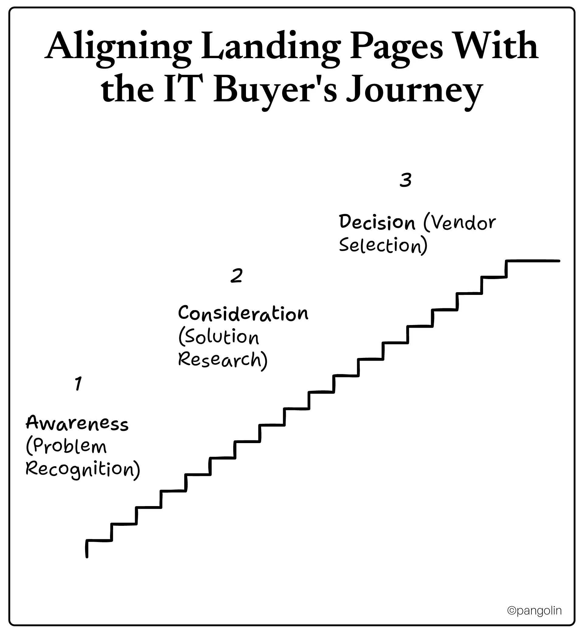
Buyer mindset: "Something's wrong, but I'm not sure what the solution is yet"
Focus: Educational content, pain point identification
CTA examples:
Goal: Establish expertise and build trust, not push for a demo
Buyer mindset: "I know I need help, now I'm comparing vendors"
Focus: Solution comparison, methodology explanation, proof of expertise
CTA examples:
Goal: Differentiate your approach and demonstrate why you're the best choice
Buyer mindset: "I'm ready to talk, but I need specifics before committing"
Focus: Service details, pricing transparency, implementation timeline
CTA examples:
Goal: Remove final barriers and make it easy to move forward
Here's the key: 48% of marketers create new landing pages for each campaign. Segmentation works. Don't try to make one page serve every buyer stage.
[[divider]]
Even small mistakes can tank your conversion rate. Here's what to avoid.
Every IT vendor claims to be "trusted," "reliable," and "experienced." These words mean nothing without backing.
Fix: Replace vague claims with specific proof, certifications, metrics, client logos, case studies.
Landing pages should have one goal: conversion. Every link you add is an invitation to leave.
Fix: Remove navigation menus entirely. No "About Us," no "Blog," no "Contact" in the header. Just the CTA.
Pages with multiple exit points see 70-90% bounce rates. Keep them focused.
Long forms feel invasive, especially for IT buyers who are privacy-conscious by nature.
Fix: Use progressive profiling, collect basic info first (name, email, company), gather detailed qualification info later when trust is higher.
Remember: Each additional field reduces conversions by 4-8%.
You might be proud of your "multi-tenant Kubernetes orchestration with zero-trust architecture." Your buyer just wants to know their data is safe.
Fix: Write at a 7th-grade reading level for wider accessibility. Simple copy converts at 11.1% vs. 5.3% for complex text.
Save the technical deep-dive for later in the sales process. Lead with business outcomes.
If visitors have to hunt for what to do next, they'll leave instead.
Fix: Every section should guide toward the conversion goal. Use directional cues, whitespace, and visual hierarchy to make the CTA obvious.
91% of B2B professionals favor mobile-first experiences, yet many IT landing pages are still desktop-optimized afterthoughts on mobile.
Fix: Design mobile-first, not mobile-friendly. Test on actual devices. Make buttons finger-sized. Simplify forms for thumb typing.
[[divider]]
Launch isn't the finish line, it's the starting line. Top-performing pages are constantly tested and improved.
Start with high-impact elements:
Headlines: Test benefit-focused vs. pain-focused
CTA copy and color:
Form length:
Trust signal placement:
90% of marketers use A/B testing for optimization. Don't skip this step.
Focus on metrics that matter:
Track these weekly. Look for patterns. If bounce rate spikes on mobile, you have a UX problem. If time on page is low, your content isn't resonating.
Monthly:
Quarterly:
Annually:
The best landing pages are never "done."
Before you hit publish, audit your page against this:
☐ Headline focuses on business outcome (not technology)
☐ Value proposition clear within 5 seconds
☐ 3-5 trust signals visible (certifications, client logos, awards)
☐ Primary CTA specific and action-oriented
☐ At least 2 case studies with specific metrics
☐ Industry-specific messaging (not generic IT services)
☐ Before/after examples or visual proof
☐ No technical jargon without business context
☐ Lead capture form limited to essential fields (3-5 max)
☐ Privacy policy linked near form
☐ Clear explanation of what happens after submission
☐ Multiple CTAs at natural decision points
☐ Mobile load time under 3 seconds
☐ No navigation menu or competing exit links
☐ Works flawlessly on mobile devices (tested on actual phones)
☐ All links and buttons functional
☐ Copy written at 7th-grade reading level
☐ Every claim backed by proof or data
☐ Clear next steps throughout page
☐ Analytics tracking properly installed
[[divider]]
Shopify pivoted from snowboards to e-commerce platforms because they figured out what actually converted customers. YouTube went from failed dating site to video empire for the same reason.
Your IT services landing page is at that same crossroads.
You can keep running generic pages that blend in with every competitor, and watch your ad budget evaporate while your sales team complains about lead quality.
Or you can build a landing page designed for how IT buyers actually make decisions: with trust signals, clear business outcomes, frictionless forms, and proof that you understand their world.
The tactics in this blog aren't theory. They're backed by conversion data from thousands of landing pages across B2B IT services.
Start with one thing: Pick the element that's weakest on your current page. Fix your headline. Add trust signals. Simplify your form. Measure the impact. Then move to the next element.
At Pangolin, we've helped ITES and B2B tech companies turn their landing pages from cost centers into revenue engines. We focus on what moves the needle, pipeline growth, not vanity metrics.
The blueprint is here. Now it's execution.
Audit your current landing page against the checklist above. Which element needs the most work?

Aniket leads content marketing at Pangolin, writing and editing for B2B tech clients who need sharp messaging and consistent output. He came from journalism and brings that newsroom discipline to content work, turning drafts around quickly and keeping quality high.